
Ceiling-height kitchen cabinets: more storage without weighing down the room
Closing the space above wall units can calm the room and add storage, but only when volumes, openings and light are designed together.
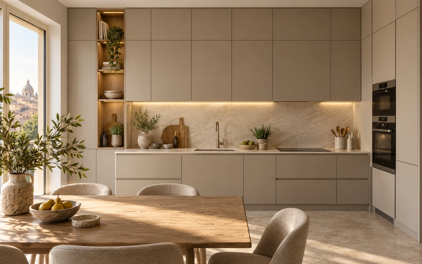
The gap above kitchen wall units often feels wasted: it gathers dust, interrupts the elevation and leaves seldom-used objects homeless. Taking cabinets to the ceiling, however, is not simply a matter of adding another row of doors. The wrong rhythm can compress the room; dimensions that ignore the real ceiling turn installation into compromise; cabinets that are all too high remain impractical. A successful design treats the upper zone as an architectural band—quiet to the eye and useful in daily life.
First question: should the cabinets really reach the ceiling?
Full-height cabinetry is useful when the ceiling is regular, storage is limited and a visually continuous wall is desired. It also suits open-plan rooms, where the kitchen needs to read as one ordered volume. It is not automatic: beams, severe unevenness or very high ceilings can make total closure expensive and produce inaccessible cupboards.
Begin with an inventory. Everyday plates, glasses and food belong between waist and just above eye level; heavy appliances stay lower. Reserve the upper band for tableware used at celebrations, textiles, baking tins and light supplies. If nothing genuinely belongs at that height, a recessed shadow line or a well-designed bulkhead may be more honest than deep, redundant cupboards.
Measure the real ceiling, not the drawing
A ceiling shown as 270 centimetres can vary along one wall. Plaster, screed, flooring and services change the final level, and even a few millimetres become visible beside a long horizontal line. Measure several points before ordering, check corners and locate pipes, vents and spotlights.
Allow a compensation zone: painted infill, a matching profile or a small recessed shadow gap. Trying to trap doors tightly against the ceiling complicates assembly and risks rubbing. A consistent, intentional infill is not a defect; it absorbs tolerances and makes the composition appear more accurate.
Divide the height to avoid an oppressive wall
One very tall door may look elegant in a rendering but feel heavy, distort or become awkward. It is often better to separate the working cabinets from an upper tier, aligning joints with tall units, fridge and oven. The gaps should create a legible elevation, not a random grid.
In a small kitchen, pale matt fronts quieten reflections; an oak niche or short open section breaks the mass without sacrificing much storage. A larger, brighter room can carry a deeper colour. Choose one dominant gesture—colour continuity, a material niche or a shadow line. Combining all three makes the wall restless.
Access: high storage must remain safe
Upper cupboards are not everyday cupboards. Store light, stable objects that are easy to grasp; avoid heavy pans, bottles and appliances that need two hands. A stable household step must open without hitting an island or dining table. Check depth too: an over-deep cupboard hides its contents and encourages accumulation.
Lift-up doors can clear the space in front, but hinges and mechanisms must match the door weight. Side-hinged doors are simple and repairable if they avoid lights, side walls and windows. Simulate the full movement and the user’s position before choosing: ergonomics are judged while opening, not only when everything is closed.
Light and worktop: relieve the upper band
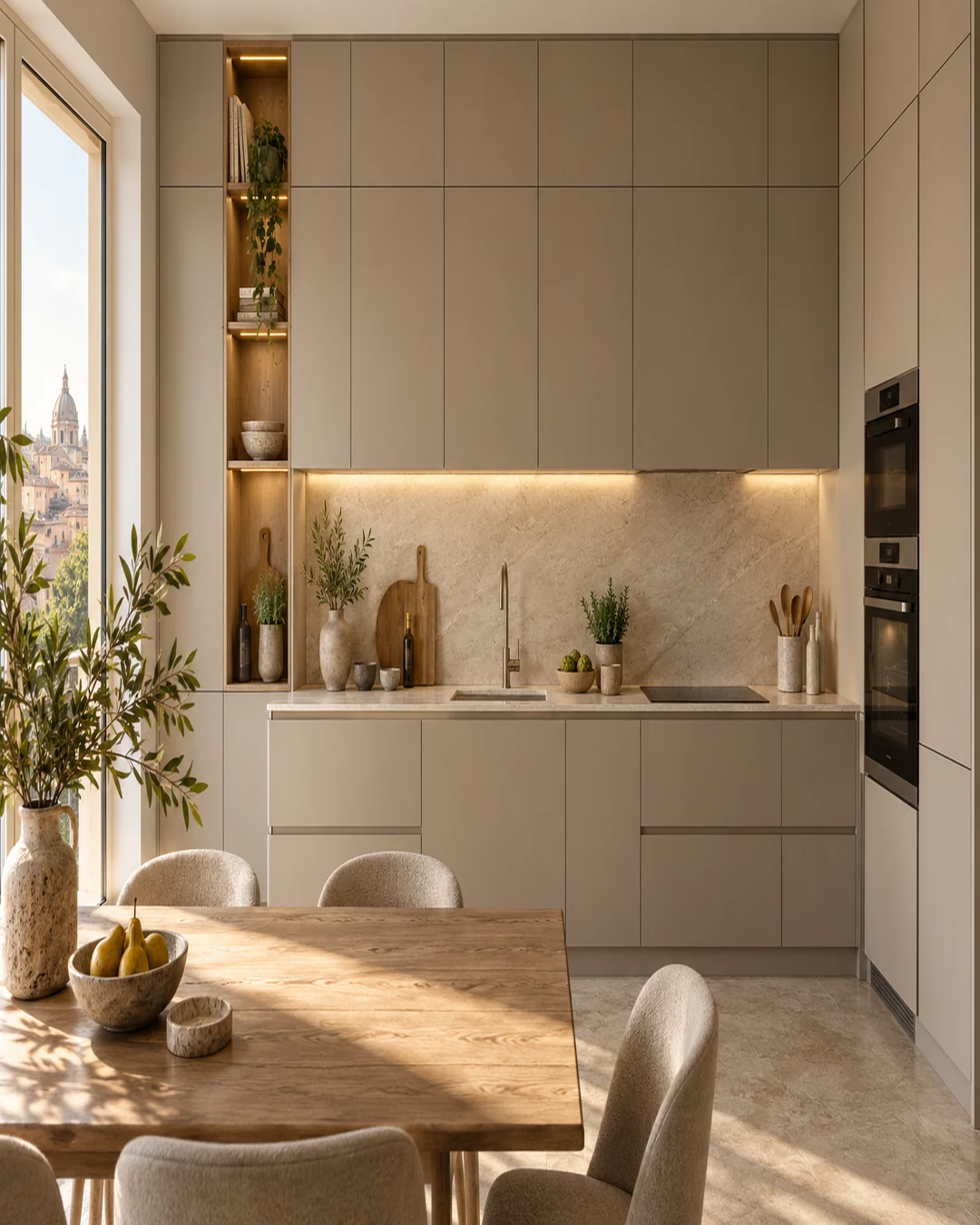
Ceiling-height storage increases vertical mass and may reduce perceived light. The worktop therefore needs continuous, screened illumination near the front edge, preventing the user’s body from casting a shadow. A warm-neutral tone keeps timber, stone and food natural; evenness matters more than spectacle.
A horizontal niche between base and wall units creates breathing room, but its height must account for taps, appliances and the user. Widely spaced spotlights create cones and dark patches. Integrate the LED profile, accessible driver and cable routes before installation rather than adding visible channels later.
Tall units, appliances and ventilation
Coordinate oven, fridge and pantry towers as part of the full-height wall. Every appliance has manufacturer requirements for ventilation, clearance and technical access; these must not be sealed for the sake of a perfectly flat façade. Grilles and plinth openings can be discreet, but they must remain effective and removable.
Aligning the top of tall units and wall cabinets creates order. When levels cannot coincide, two deliberate volumes are better than improvised fillers. Hoods, waste pipes and sockets also require access. The most elegant scheme is the one that can be maintained without dismantling half the kitchen.
Materials, cleaning and longevity
Matt fronts conceal fingerprints and small irregularities; gloss surfaces multiply light but expose imperfect alignment. Veneers add warmth, while laminates and lacquer offer colour continuity. Consider steam, cleaning frequency and whether a damaged door could be replaced in future.
Closing to the ceiling removes a dusty horizontal ledge but adds joints and edges. Ask how sides, end panels and upper infills will be finished, not only which front colour is supplied. Durable kitchens are recognised by quieter details: accessible hardware, ventilated backs, correct seals and removable modules.
Budget: where investment matters
Costs rise with non-standard modules, special doors, shaped fillers and installation in uneven rooms. Keep the working zone standard and customise only the upper tier or end closure. A well-proportioned bulkhead can cost less than another row of cabinets while producing an equally calm elevation.
Request separate prices for survey, cabinetry, hardware, lighting, electrical work and installation. Ask for a front elevation showing every joint and a section through the ceiling connection. Spending on measurement and drawings prevents improvised changes; savings should come from simpler openings, not from removing safety or adjustment.
Mistakes to avoid before ordering
Do not rely on the nominal ceiling height; do not store heavy objects high; do not obstruct ventilation; do not let doors clash with lights; and do not alternate joints without a rule. Avoid covering an entire poorly lit wall in a dark finish unless the design compensates with pale surfaces and balanced lighting.
Tape the main lines onto the wall and view them from the table, entrance and living area. Imagine every door open, test where a step would stand and check where light falls. This inexpensive rehearsal reveals issues that a two-dimensional plan may hide.
Technical references
Institutional websites and industry documentation consulted on 7 October 2026.
Turn storage into architecture
White Diamond can redesign your kitchen wall from real measurements, coordinating modules, tall units, lighting and ceiling junctions. Plans, elevations and personalised renderings let you compare a full-height solution with lighter alternatives before ordering, avoiding redundant cupboards and costly site corrections.
Request your personalised quote